SubHQ

Managing complexity

Summary

SubHQ is a construction platform designed specifically for subcontractors. It manages projects, resources, and financials from project planning to closeout. The platform connects every project contributor with the owner and GC, as well as additional specialty contractors. The centralized dashboard allows managers to handle project details, schedule tasks, and view progress while also tracking expenses and equipment. Created in 2013, the tool was designed to help American Ironworks and Erectors track and manage all aspects of their construction process. After years of tweaking, the opportunity to provide this tool to other companies became an obvious next step in the company's growth model. Especially considering it had the potential to outpace the core business earnings as the software gained adoption and scaled its offerings.

Challenge

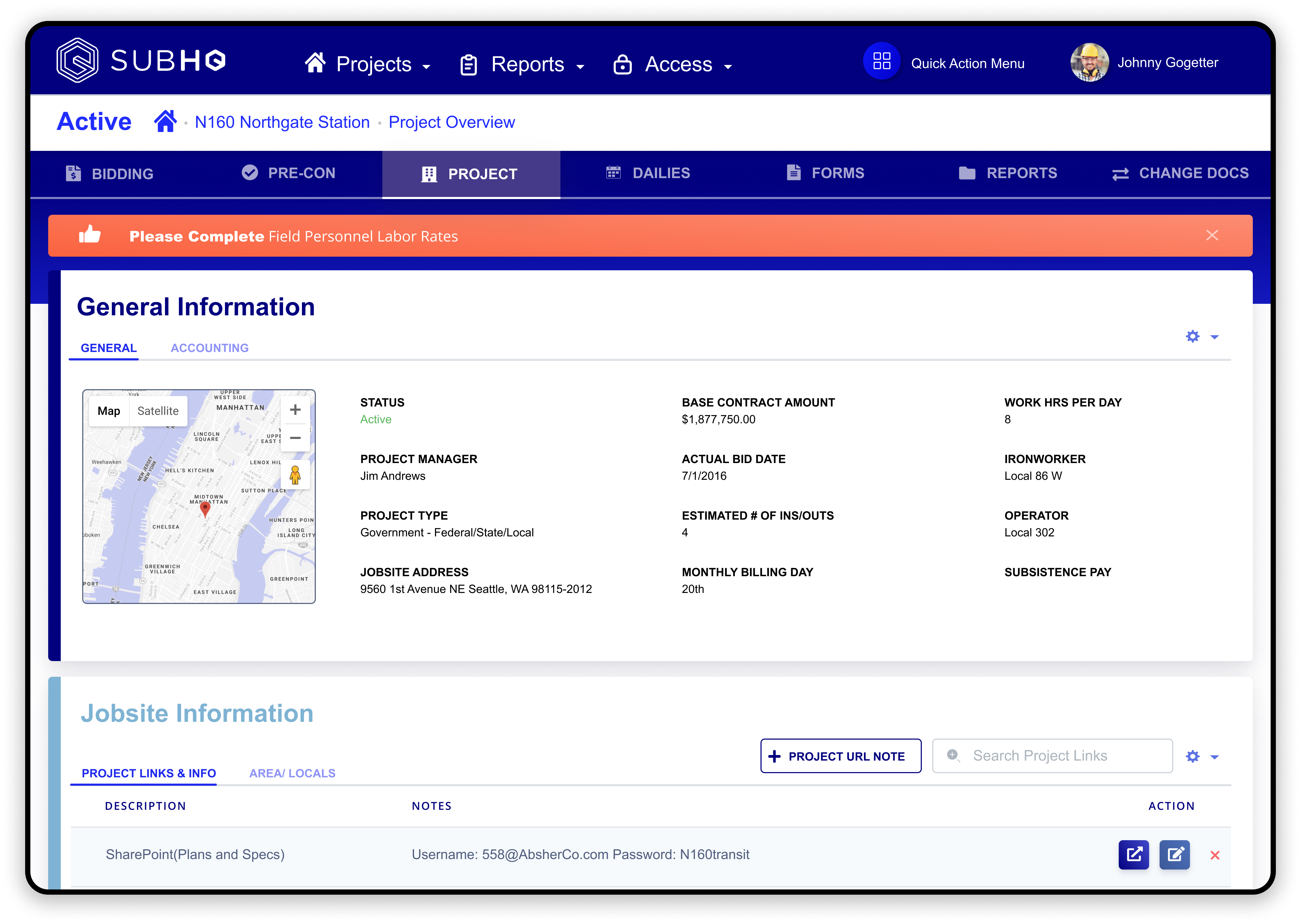
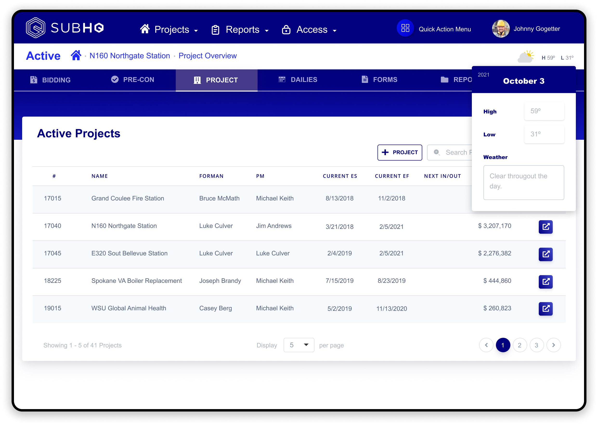
SubHQ set out to provide subcontractors with the same level of construction management software available to general contractors. While the opportunity was huge, years of iterative development had led to significant complexity debt, stifling progress. Misaligned user actions, high cognitive load, and inconsistent workflows created friction across the platform.

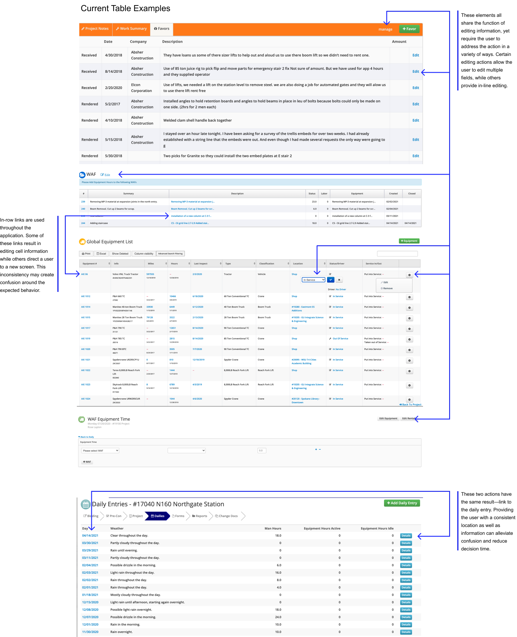
Adoption rates were low, onboarding took weeks to months, and UI inconsistencies made tasks confusing. These issues stemmed from multiple developers implementing their own vision over time. Screens featured varied editing methods, inconsistent action placements, and shifting terminology, forcing users to interpret meanings on the fly. We hypothesized that the absence of a cohesive design system was driving these inconsistencies, contributing to user confusion and prolonged onboarding times.

Role

Lead Product Designer

Services

Stake Holder Interviews

User Interviews

Hueristic Analysis

Personas

User Journey Mapping

Brand Workshop

Competitive Analysis

Updated Brand Guide

UI Style Guide & Design System  

Challenge areas:
  • Onboarding new users
  • UX/UI complexity debt
  • Inconsistent design conventions
  • Excessive cognitive load
  • User centered design

UX Research

The initial goal was to understand the current system they were using, how it was being used, and what areas were causing frustration and confusion for users. It became clear early on that we would need a deeper understanding of the motivations that were currently driving stakeholder and end-user decisions. We understood that the growing level of complexity within the application would require a strategic approach to understanding what key workflows had the greatest impact to end-users and what areas were hindering onboarding times.  Therefor, we began our discovery with interviews and contextual inquiry in order to better understand the role the existing app played for end-users.

In-field workers reported daily interaction with the Project Overview , Dailies, and WAF (change management) features of the app. I learned how and where interactions took place, what issues create barriers to adoption, as well as challenges for subcontractors in the field. In addition, I gleaned insight into the most important interactions that effect in-field users on the jobsite and how I could improve these features to better serve them. It was a valuable step in creating a product that provided greater usability, a delightful visual appeal, and long-term adoption.

Deliverables for this phase:

  • Design Brief
  • Personas
  • User Journey Map
  • UX/UI Audit

Heuristic Analysis

The examples below highlight key challenges in the existing application. While tables—one of the most frequently used elements—maintained a consistent aesthetic, their functionality and user experience varied drastically. Different approaches to editing included in-row links, expandable icons, and in-row editing, with actions placed inconsistently across tables. Additionally, terminology for user actions shifted between tables, forcing users to interpret meanings and expected outcomes on their own. These inconsistencies extended throughout the application, likely resulting from multiple developers adding features without a unified framework or design guide.

Branding Workshop

In parallel to conducting user research, we conducted a branding workshop to establish a consensus around the brand direction and develop a foundation for the brand's external perception. The tasks included an interactive discussion on 10 year goals, company vision, brand personality, and competitive landscape.

The exercise was adapted from the Google Ventures 3-hour framework described in Sprint, which was written by Jake Knapp. The outcomes from this workshop provided a roadmap for an updated brand guide that we quickly went to work on. The images below were taken from the branding workshop, although the names of participants and any sensitive information have been removed.

Brand Guide

While elements of their existing brand remained the same, additional elements such as, brand voice, typography, deck, design, and advertising guidelines were added to fill out the overall brand guide.

UI Designs

The final redesign of the platform and brand has made critical tools more accessible, enhanced user affordances, reduced workflow friction, and eliminated inconsistencies, all while establishing easily deployable design conventions. This standardization has not only reduced production costs but also facilitated easier product scaling. Users in the field can now concentrate on their work without the hassle of inconsistent design patterns causing confusion and frustration. Furthermore, the redesign has significantly lowered the learning curve for new users, addressing a previous pain point that demanded extensive support team involvement.

Style Guide & Design Systems

By establishing a branded design system for SubHQ, new features as well as interactions can be easily built and deployed—saving them time and money by improving consistency across their platforms and reducing time between releases. Ultimately, this allows their designers and engineers to focus on addressing bigger problems and better outcomes. The subsequent style guide provided developers with the necessary tools to implement consistent design conventions.

Additional Case Studies

Gatsby AI

AI Agent driven trading strategies
Read case study

Guest Checkout

Streamlining the parking and payment experience
Read case study

Wallet Payments

Toronto's wallet payment audit and updated user experience.
Read case study